|
Aidan Gothic
|


|
Inspiration
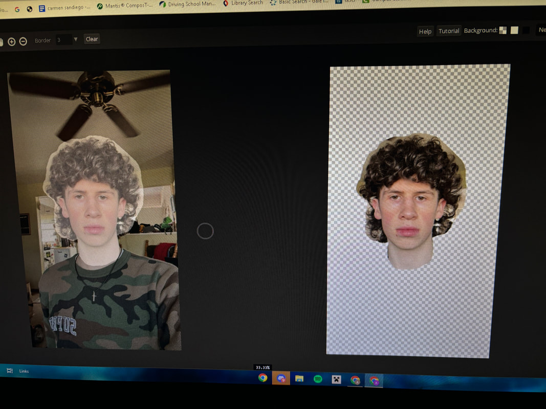
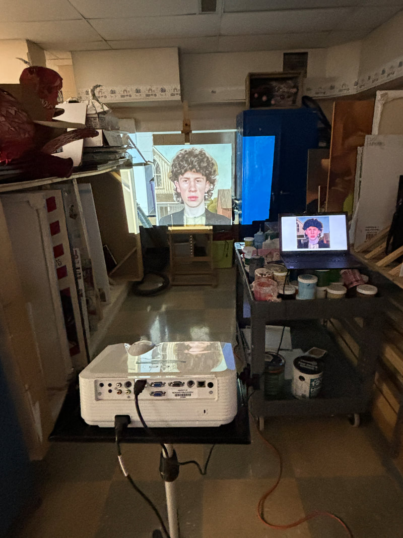
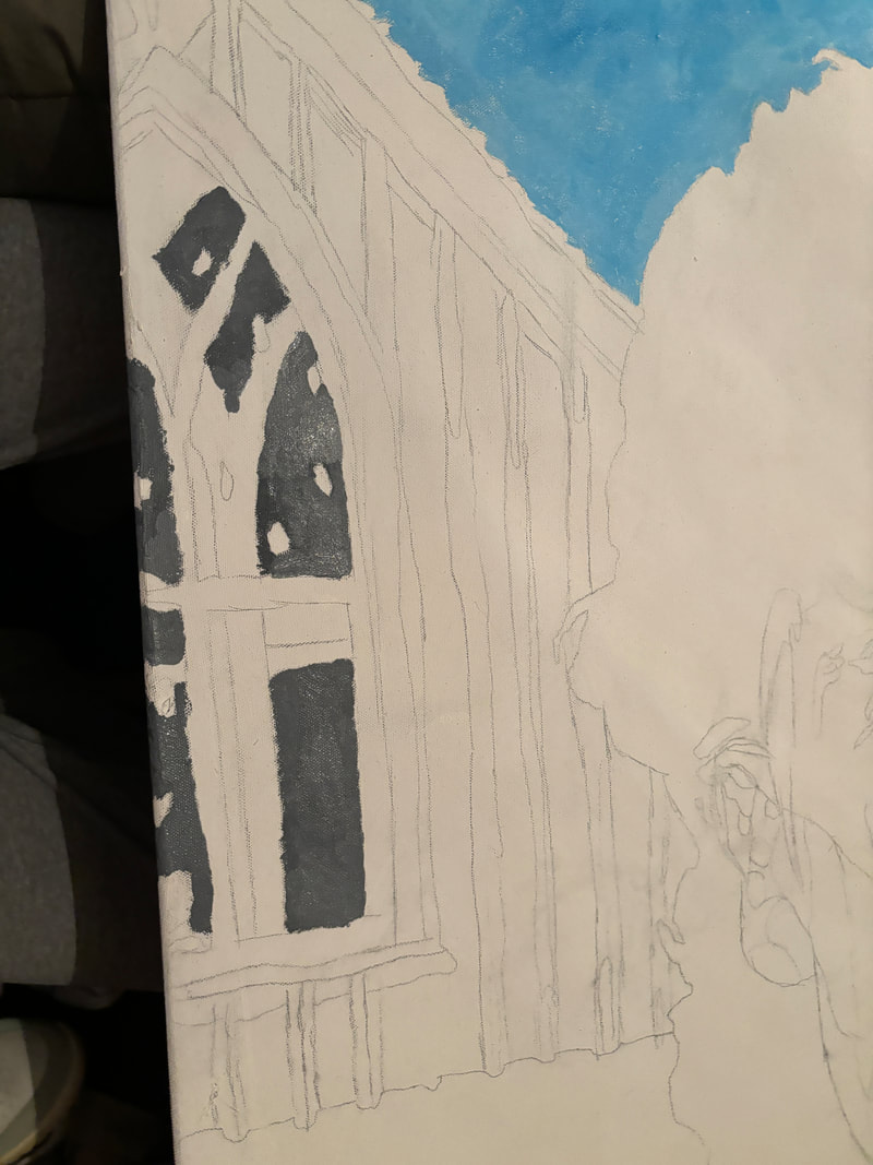
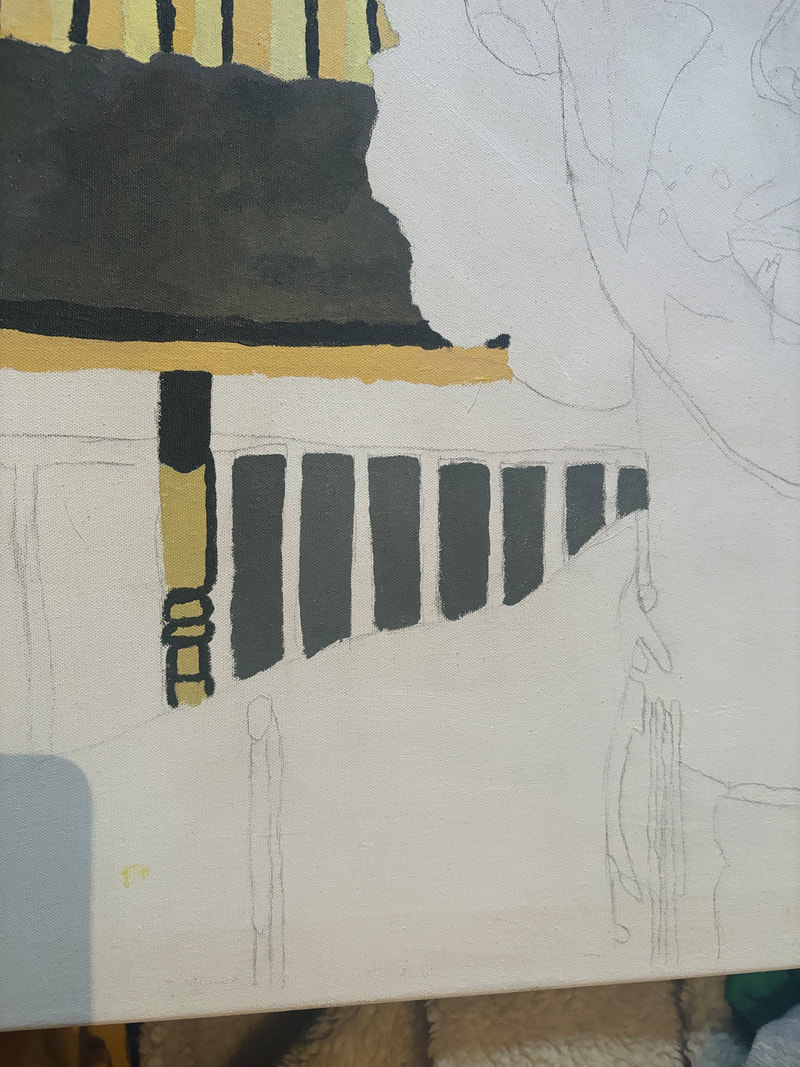
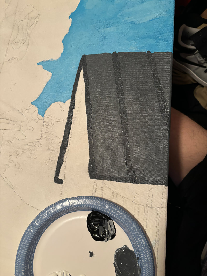
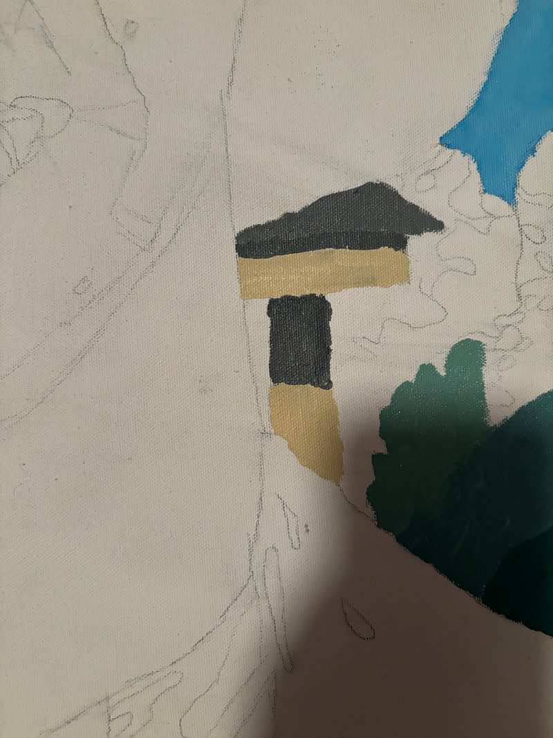
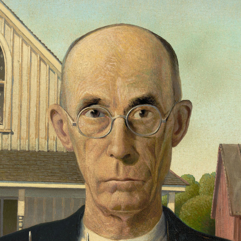
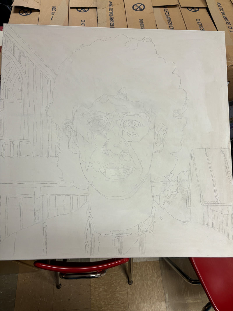
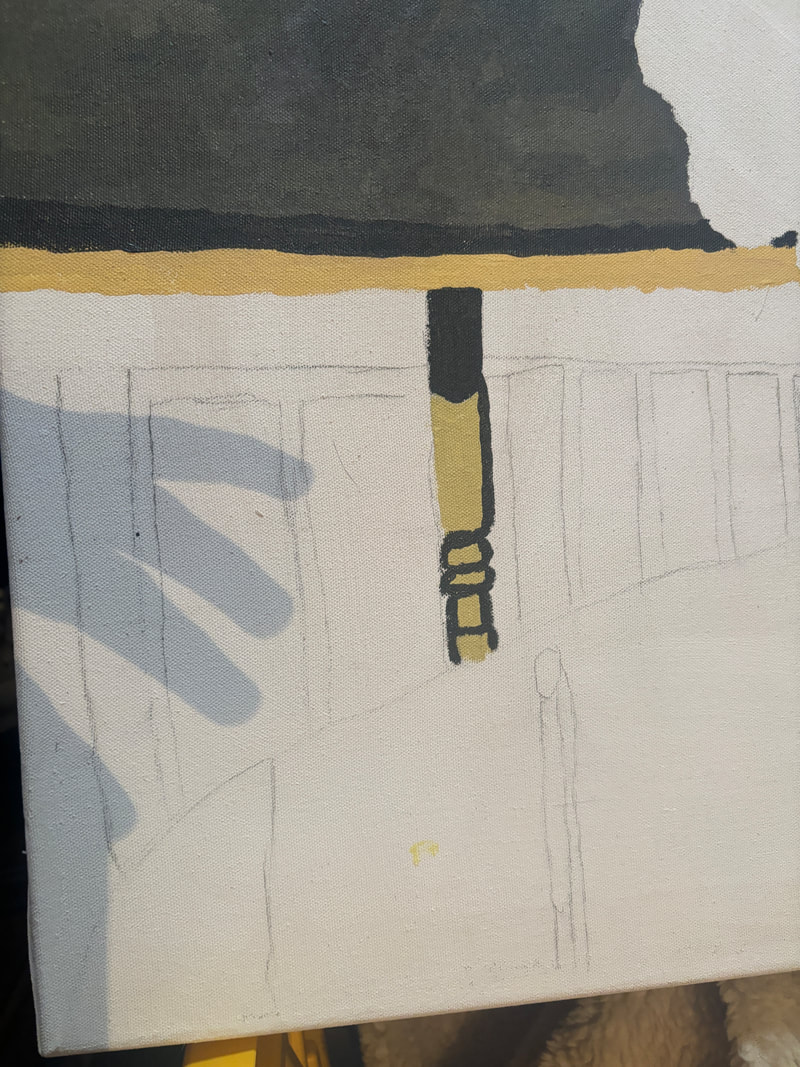
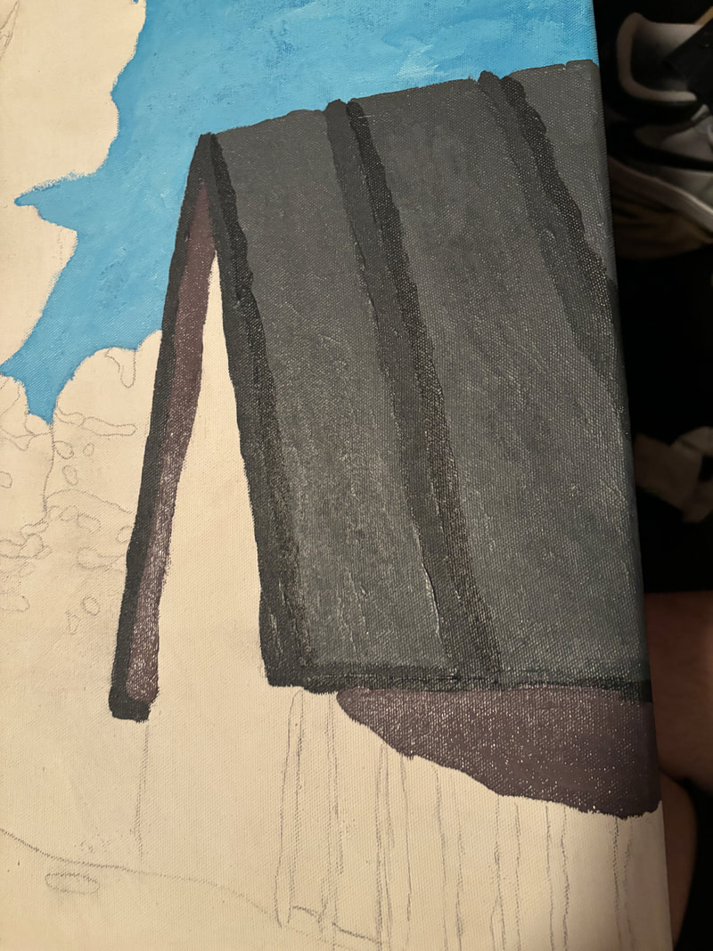
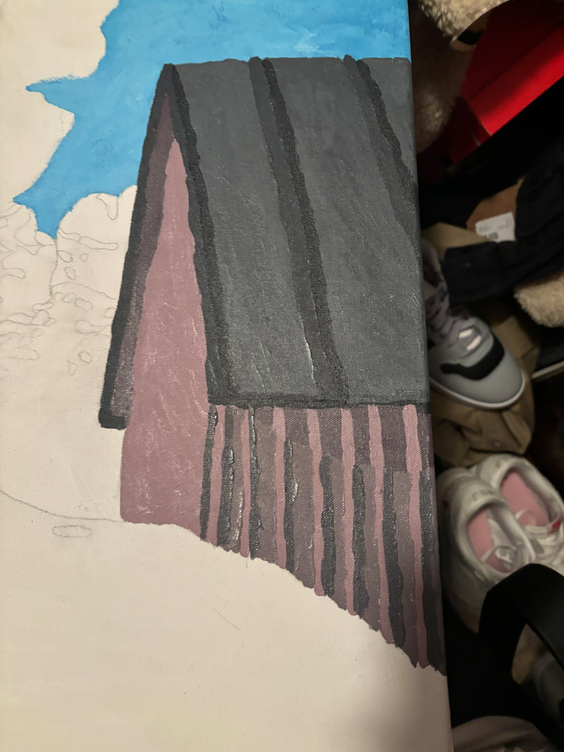
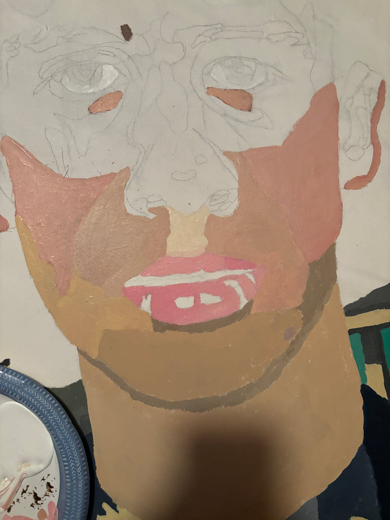
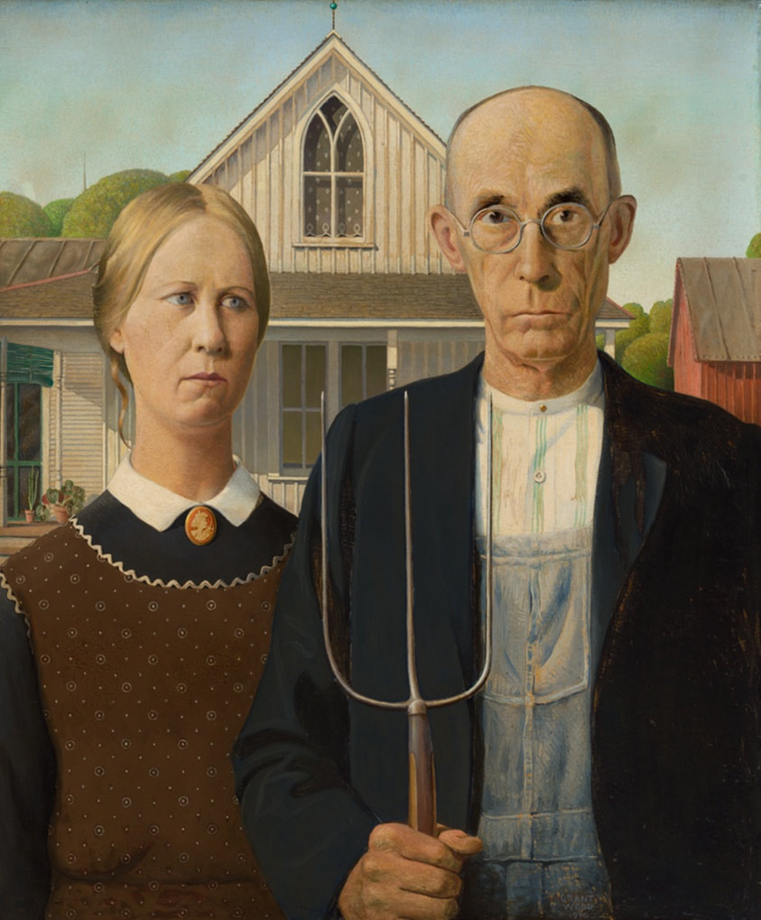
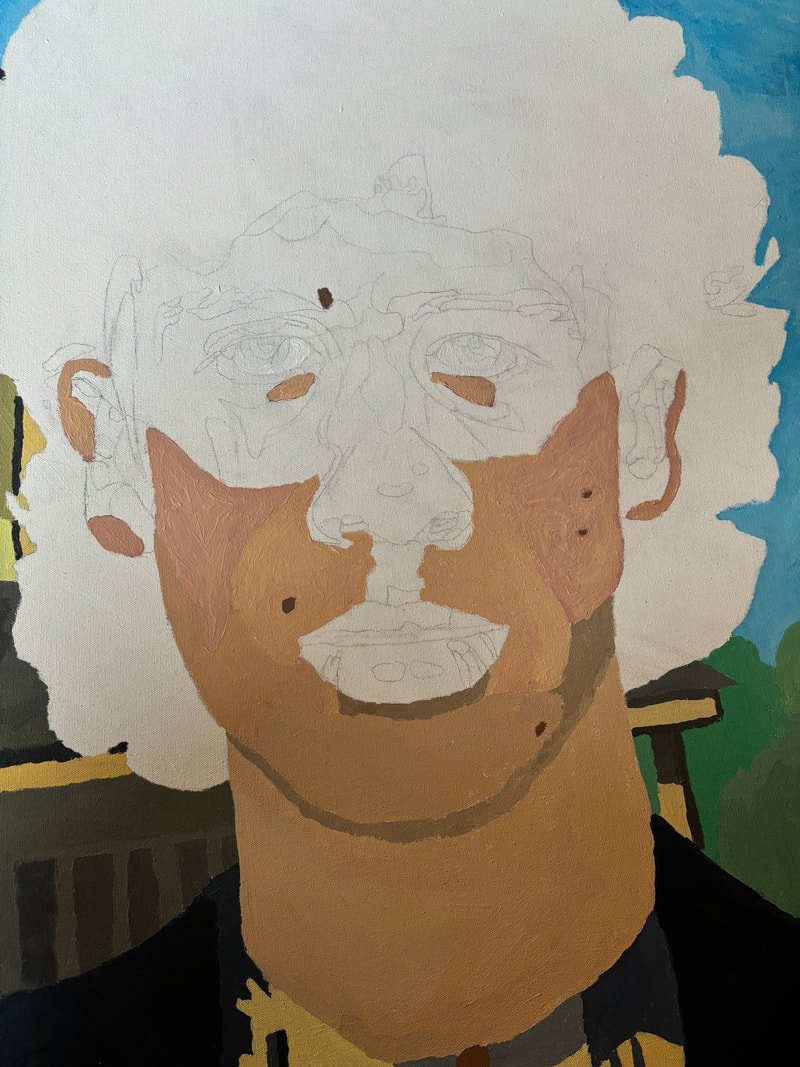
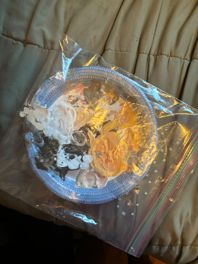
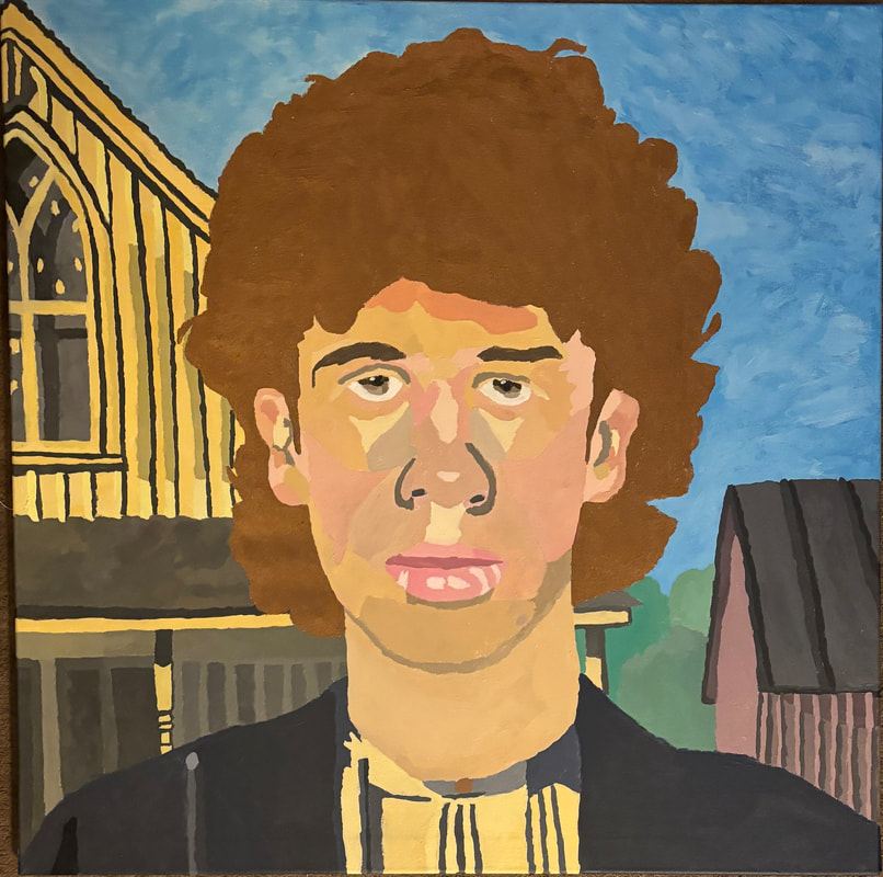
As my inspiration for this artwork I used American Gothic by Grant Wood. American Gothic is a popular painting that was made in 1930 in Regionalism movement. Grant Wood created this painting to represent the rural values of the Midwestern United States. Grant Wood also created this painting to represent the struggles that farmers were going through during the Great depression. Grant Wood created this painting with oil paints and blended them together to create the realistic look. This painting is of a farmer and his daughter who are standing in front of their house with a serious look on their face. When I first saw this painting I was confused and interested at the same time. This painting left me with so many questions and made me want to learn the background behind it. When I researched this painting I found out that this painting was made for many Americans that were struggling with the Great Depression. This painting is supposed to relate to the public because these farmers were dealing with trying to support the economy when it was a mess. Planning I first started the planning stage with sketches of different directions I could go with this self-portrait. With these sketches I know I wanted to put my face on popular paintings in history. With my first sketch was my face on the farmer from American Gothic because it connects to my theme of the environment because it shows the architecture during the 1930's. For my second sketch I put my head on Van Gogh's famous self-portrait because I believed it would be fun to paint a self-portrait in his style. For my final sketch I decided to put my head on the Mona Lisa because of how popular the painting was and I think it would be fun to put my head on that famous painting. After I had all three of my sketches complete I decided on the American Gothic one because it best connects to my theme. American Gothic connects to my theme of the environment because it shows how agriculture was struggling during the Great Depression and after the Great Depression because that is when agriculture took off. Process For this project I had to make a three foot by three foot self-portrait this meant the first step of this process was to create a canvas. I started making my canvas with the wooden frame which I did by connecting four three foot stretcher bars together. I had to make sure that they made 90 degree angles because if they were not my canvas would bend when it was done. The next step was to cut out the size cloth that I needed to sketch around the canvas. I did this by laying my frame on the ground with the cloth below it, this helped me get the size that I needed. After I had my cloth cut out, I started to connect it to the frame with a staple gun. I did this by starting with the top then moving to the bottom and finished with the sides. The next step was to cut the extra cloth off because I didn't want it to get in the way. The last step to making my canvas was to gesso it which would tighten up the cloth which is also a base layer on the canvas. The gesso dried fast and couldn't be redone so I had to work fast but also do a good job. I started putting gesso on in the middle and work my way to the outside because this would tighten up the middle first and work its way to the outside which is what I wanted. After I had the main face of the canvas complete I did the sides of the canvas and this would complete my canvas. After I had my canvas complete I had to create something to put onto it.The next step of my process was taking a photo of myself in front of my window to get the same light that the farmers had in American Gothic. I took this photo to get a good reference photo that I can look at when I am painting. After I had my photo taken I put it into a photo editor and cropped just my face, hair and neck out of the original photo and put it onto the father farmer in American Gothic. After my face was on the painting I zoomed in on my shoulders and up for my painting because I wanted it to be the only focus for this painting. After I had my reference photo complete, I projected it onto my canvas with a projector. I drew over the projection on my canvas because this would be the easiest way to do it because of the size of the canvas. The only other way is to draw a grid on both my canvas and my reference photo and slowly do it that way but that would take much longer. I drew the projection on the canvas in pencil so it would be easy to cover up with paint later on. After I had what I was going to paint on my canvas I was ready to start painting. I started painting with the sky because my plan was to work on the thing farthest back and slowly work my way forward and the sky was the farthest away from the camera. Painting the sky wasn't hard but it was time consuming to cover that large amount of space with paint. The sky took me around five hours in total because I messed up on the right side of it and made it darker than the left side. That made that time go up because I had to redo half of the sky. The next thing I started to work on was the house which took me way longer than I thought it would. I started the house with the window because I wanted to do the darker colors first. I started with the lighter grey and shifted to the darker shadow in the window.The next thing I did was the main cream color that the house was which I created by mixing my skin color, yellow and white. This color took me a long time to make especially because I kept changing it a lot of time but I'm really happy that I did because I think it came out really well. I started with this color on the top of the house and moved my way down the house. It was hard to try to make straight lines with my paint brush because it kept going to the side and not down. How I fixed this problem was to add more of my paint to the brush because then it was more structured which produced better and straighter lines. I also used this color around the window and in the middle of the frame. After I had the top of the house complete I started adding shadows to the lines of the house which made the house look much better and the house started to come together. Then after that I started working on the lines of the house again by making two different lines. I made these two colors by adding white to the cream color and by adding black to the main colors. These two colors created the lines on the house and got part of the shadows that I was going for. The next step I took was adding that dark grey color I've been using to make the shadows to the lines which made the house look better and a lot more complete. After the upper part of the house was complete I started working on the porch. I started with the roof with dark grey and then I did the lower part with a darker grey for shadows and the cream color. I continued these colors down the post with the cream as the post and the grey with the shadows made by the post. After the post was done I started working on the first floor of of the house. I started the first floor with the widows which were a dark ashy grey. Then I moved to the left which had darker colored windows and worked on the frame of the windows too. These window frames were created with many different shades of grey. The window frames were made with the same color as the window just a little lighter color. When I was painting the frame I would paint the window and then add a little white to that color and then paint the frame of the window. After I finished the windows and the frames I had to do the actual house which was much darker because of the shadows. I took my cream color and added black to it to get that darker color. After I painted that color the house in the background was complete which took me around eight hours which took the most amount of time in this painting. This is what took me the longest during this process but I also believe it is the best part of this painting. After the house on the left was done I started on the shed that was on the right of the camera. I started the shed with the roof and it's big grey panels and the darker outlines in between them. When painting the roof I had to fix a mistake I made when painting the sky. When I painted the sky I cut off the roof of the shed because I wasn't looking at the reference picture. After that I had to add shadows to the structure parts of the roof which completed the roof of the shed. The next step was to add shadows from the overhang from the roof. I made this color with red and grey because I wanted to match the color as much as I could. After those shadows were complete I added white to the color to lighten it up which made up the main color of the shed. I added this color on the face of the shed and also the siding. After the siding was complete I added the shadows to the siding and also added a darker color in between each siding. After I added that color in between the siding the shed was complete. After the shed I work on the rest of the house the stuck out on the right of my neck which was pretty easy because I already had all the colors made I just had to put them in the right spots. I started with the cream color and shifted to the grey rood and the shadows. After that I cleaned it up with a darker grey for the shadows on the right of the post and of that overhang. The next step after the rest of the house was complete was to do the bushes next to it. I started with the bush closest to the shed and worked my way upward going lighter as I went. The bushes were easy to make because I only had to make one green and then just change it on each bush. I started with the bottom bush and made the color lighter and did the next one. After I had two bushes down I made the color even lighter and did the last bush . After I had my background complete I started on my jacket which was a navy blue color and wasn't too challenging because it was all the same color on both sides of the jacket. After I painted the navy color I added a little black to the color to make it darker. After I made that color I used it to paint where my arm met my chest. After I had my jacket complete I had to work on my under shirt. I took the navy color and added a little white to it because I needed it to be a little lighter. After I made that color I added a little more white for the middle of my collar. After that was complete I used the color from the house for the left side of my under shirt and for the rest of my under shirt I made it lighter with some white and then painted the rest of my under shirt. The last step of my under shirt was the button in the middle of my collar. I created the color for the button by mixing red and brown to make the maroon color that it is. After I had the color ready all I had to do was pain the small circle in the middle of my collar. After I add my shirt done it was time to work on my neck which was simple because I already had a tube of paint for my skin tone. This is important because it meant that I wouldn't have trouble mixing the same color every time. I painted the main part of with that color and for the shadows under my head. I created this color by adding a bit of black to the skin color to darken it up a bit. After I painted my neck shadow then my neck was complete. The next step was to do my face which I started at the bottom and worked my way upward. I started with my chin and went to the right and left because I wanted to focus on my skin color at first. As I went up my face my skin color become lighter because there was more sunlight hitting it. The hardest part of painting my skin color was when I had to paint my rosy checks because I kept making the color too red and then it made it look bad. Another thing that I struggled with was my freckles because I would make them too dark and too big which made them look like I had moles on my face. So I covered them and just made the skin color a little darker which made them look better because they were not an eyesore anymore. I also I experimented with the freckles on my checks because I didn't know how to make them look good. I tired putting brown paint on an old paint brush and lightly touch the canvas with it but that didn't go how I wanted. Another thing I tired was putting brown paint on a paint brush and flicking the paint at my canvas which also didn't look good either. After I failed on the freckles I took another look at my reference photo and I realized that you couldn't tell I had freckles because it was at the end of winter and my freckles couldn't be seen so I decided not to paint them. After I went though that I started on my lips which weren't had because I just had to make a pink color which I did by mixing a little bit of red in white. then I did the middle of my lips which I created that color by adding black to my color to darken it. After I did the dark part of my lips I moved to the light part of it where the light reflected of my lips the most. I created this color and with the smallest part of red and a lot of white. After I painted that part of my lips they were complete. After my lips were done I worked my way up and did the nose. I did the nose by adding a little white the my skin color to make the tip of my nose and surrounded it with my skin color. The next thing I did was making a darker color out of black and my skin color for the shadows made by my nose. Then I put this around the sides of my nose and on the holes at the bottom of my nose. Next I went around my eyes and eyebrows with my skin color because I didn't want it have to use it again. After I did that my skin was complete and I moved on to my eyebrows. I did my eyebrows with my hair color that I had which I also did my side burns when I was using that color. The next step after my eyebrows and sideburns was to do my eyes which were easier than I thought. I started my eyes by the doing the white of my eyeball and then moved to the eye pupil. I did my pupils by starting with a light brown and darken it as it went up which I did three times. After that I painted the middle of my pupil as black and added a little white on the side to show the refection from the light. After I did that my eyes and face were complete and I just had my hair left to do. I knew my hair wasn't going to be hard but I knew it was going to take a long time. I got a tube of brown paint that matched my hair color because if I mixed the color every time I knew it was going to be harder because that is what happened in with the sky and that took longer than it should have. I started in the middle of my hair and went to the left near the shed using a big brush for putting paint on the canvas and using a small brush for getting in the small cracks in my hair. After I finished the right side I moved to the middle again and finished that off. The last step was to do the left side by the house which I was scared to do because I didn't want to mess up the house and have to redo it. Thankfully I didn't mess it up and finished off my hair. After I finished my hair my painting was complete. Reflection Looking back at my painting I am very proud of it because I believed it came out very well. I feel that this painting is the best piece of artwork that I have ever created because of the way it looks and the time I put into it. I would say that I put around 25 hours into this painting which sounds like a long time but I believe it shows in the final artwork. If I would to do this painting again I don't think I would change much about it but one thing. If I did this painting again I would probably add more colors to my hair like lighter and darker browns to the light hitting my hair like I did with my face. Otherwise from my hair I wouldn't change anything else because I feel I did everything else very well and am proud of the final product of this painting. Critique Taking a look at my painting and Grant Wood's American Gothic there are many similarities and differences. The first I noticed when looking at these paintings next to each other is the range of colors. Both of these paintings use a wide range of colors, this is seen on the right side of each painting with the red, blue and greens. Another similarity between these two paintings is the mood created by them. Both of these paintings create this serious mood and this is because of the look on the people's faces. On my face and the people in American Gothic have this serious look on their face which creates that serious mood. Moving to the differences within these two paintings there are also many of them. The first difference is the technique used in both of them. Grant Wood blends most of his colors while in my painting I choose not to blend my colors because I wanted my painting to stand out from other portraits. Another difference is the materials used to create these paintings. Grant Wood created American Gothic with oil paints while I created my painting with acrylic paint. I choose to use acrylic paint because it is what I have used the most and was most comfortable with. Experimentation I experimented with many things in this painting because I have never made a painting at this size and painting a person in this style. The first part I experimented with was mixing colors together to create the correct color. This is best seen when I was painting my cheek, I had trouble creating my rosy cheeks because I was making it too and it would become too dark. The way I overcame this was by adding barely any red because the red would over power my skin color. The next thing I experimented with was trying to make my freckles and did this by trying my different things. I first started by making brown dots on my face but that looked more like moles. After that way failed I tried another way by dipping the tip of my paint brush in brown and lightly painting the canvas. That way failed too so I decided to flick brown paint at my cheek which also didn't work. After all of those methods failed I realized that my freckles couldn't be seen because it was winter time. The last thing I experimented with was trying to save paint. Due to the size of this painting I had to pour out a lot of paint which caused me to pour too much paint sometimes. I found a way to save my extra paint by putting it in a plastic baggy and putting it in the fridge. This caused me to save paint and time from mixing colors. ACT Questions Clearly explain how you are able to identify the cause effect relationship between your inspiration and its effect on your artwork. The cause that American Gothic had on my painting is obvious because I put my head on one of the people in the painting. Both of these paintings have the same background with the same house and shed in the back. Another thing it affected was the range of color that was used in both of these paintings. What is the overall approach the author has regarding the topic of your inspiration? Grant Wood approached the rural values of Midwest America by trying to represent it and bring attention to the struggles that the Midwest was going through at the time. What kind of generalizations and conclusions have you discovered about people, ideas, culture, etc. while you researched your inspiration? I discovered that Grant Wood was born and grew up in Iowa and was trying to represent what he cared about. I also discovered that farmers were affected by the Great Depression very much out of all other Americans. What is the central idea or theme around your inspirational research? The central idea that I found out about American Gothic was created for people to relate to because most people were struggling. What kind of inferences did you make while reading your research? I made the inference that Grant Wood cared about what he was doing and Grant Wood was also trying to relate to other Americans that he wasn't a up tight artist and was just like them MLA Citation Wood, Grant. “American Gothic.” The Art Institute of Chicago, Arts of the Americas, 1 Jan. 1970, www.artic.edu/artworks/6565/american-gothic. “The Painting.” American Gothic House Center, americangothichouse.org/american-gothic. Accessed 19 Apr. 2024. “How to Mix Acrylic Paints: An Artist’s Guide to Creating Colors.” Painting to Gogh, www.paintingtogogh.com/blogs/news/how-to-mix-acrylic-paints. Accessed 19 Apr. 2024. |