|
The Beach Be Clean
|


|
Inspiration
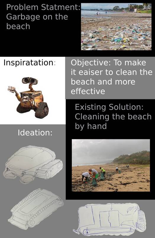
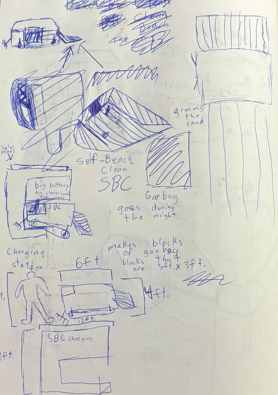
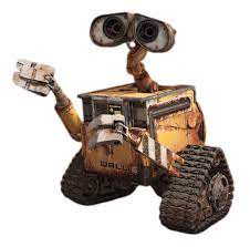
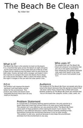
My biggest inspiration during this project was WALL-E from the Disney movie WALL-E. I took inspiration from WALL-E because when I first was thinking of an idea of how to clean a beach I was thinking of other things that clean without humans helping them, the first things that came to my mind was WALL-E. When Pixar studios was making the design for WALL-E they were trying to make a machine that cleaned the Earth in the movie but something that also felt alive and had emotions. There are many aspects that go into making WALL-E what it is, like [ his continuous tracks as his feet to move around, his hydraulic shovels as arms to grab and pick up objects, and finally he has two camera lenses as his eyes so he can see and show emotions . When I first saw WALL-E, I was confused because I didn't know what I was looking at because there is so much going on with his design. After I took some time and processed what I was looking at, I liked his design because of all of the moving parts and the rust look that he has. When looking at WALL-E's design, one of the biggest elements that go into it is shape. WALL-E is made up of mostly geometric shapes, which creates that robotic feel that he has. WALL-E also has a rough texture all over him to also create that rustic feel to make it look like he has been around for a long time. The biggest thing that is emphasized in WALL-E's design is his eyes because they stick out from the rest of his design. When I first saw WALL-E's design, I first saw his eyes then moved down to his box body and then moved to his legs then finally his arms. My eyes did this because with WALL-E's design he has little robotic parts connecting the more important bigger parts of his design. This artwork was created for the movie WALL-E and this artwork was the main protagonist in the movie. The emotion I felt when looking at WALL-E for the first time was happy because I thought he looked like a cute little robot. Planning When I first started on this project I knew that I wanted to make something to help the environment in some way but I didn't know exactly what I wanted. Then I watched the movie WALL-E and I realized that what I wanted to do, is make something that picks up trash and compacts it into little cubes. After i had my ideas and started to put them onto paper with three different planning drawings. After I made my three planning drawings one of my product itself and the other two of how I am going to present my product on the posters. I designed my product like this because it works well and still looks semi decent. I made the layout of my posters look like this because I didn't want them to be really confusing so the viewer was not confused when looking at my posters. .The next step was to plan out how I wanted to organize my broads about my product. On the left you can see how I was trying to plan out my broads. I knew on my first board I just wanted my product with little boxes with text in them explaining what the viewer is looking at. For the second one I knew I wanted to go more in depth on why I did this and with how I developed this product. I am not good at making art on my computer, so my plan is to draw my product by hand on paper and then take a photo of it and put it on my board that way instead of trying to make it on some art program. This product will show my theme because it is directly connected to it. My theme is the environment and my product will help the environment by cleaning up the beach and getting rid of beach pollution. I plan to use my theme to show the emotion concern because I want the viewer to be concerned about beach pollution problem that we have. Process My plan is to make an outline of my product on a normal piece of printer paper and then transfer it onto a piece of painting paper to make it easier for me. I first started with making an outline of my product in my sketch book. Then I cut out my outline and scribble on the back. After I did that I put my outline on top of my painting paper and traced it. This made a made a faint out line of my product because it made it easier to paint my product. I added color by painting with gouache and I used gouache because I just used it to create my illustration piece. I decided to make my product green because I wanted it to resemble a turtle. I made the top part dark green to attract more light toward the solar panel to create more power. After I added color to my product I didn't like how it looked so I added a black outline to it with a illustration marker, which in my opinion made it look much better. After making my product I started making my first poster which is going to explain why I create this product and what problems it is going to fix. I first started with putting my problem statement which is "Garbage on the beach" on my poster with an image of trash on a beach. Then I put a photo of my inspiration on my poster which is WALL-E from the movie WALL-E. Next I put my objective on the poster which is "To make it easier to clean the beach and more effective". After that I the already existing solution which is people picking up garbage by hand and I also put a photo of people picking up trash on a beach too. Next I put my ideation with photos of my sketches of my product. After I did all of that I was done with my first of two posters. The next after making my first poster was to make my second to showcase the product itself and explain what it is about. I first started with the title of "The Self Beach Cleaner" and then I moved on to putting my product on the poster. I took the photo of my product that I made on paper and cropped it and put it on my poster. The next thing I did was add an image of a person's shadow to show the scale of the product and give the viewer a better understanding of what my product is. Then I wanted to give the viewer context of what my product is, who uses it, it's audience, and what problems it solves. After I added the answers to those questions on my poster the second one was done. Reflection Looking back on this project I would say I did a pretty good job when it comes to designing my posters but I do think I could've done better when making my product. I feel I could've done my product better because it looked slopping because I made it on better and then put it onto my poster. If I knew how to do digital art and made it on the computer I feel it would look better because then the viewer would not see my paint strokes and would look better overall. Critique Looking at my inspiration versus my product there are many similarities and differences. Something that is very similar between my inspiration and my product like the tracks that both of them have to move around and how they both make boxes of trash too. There are many more differences like how WALL-E has arms and eyes but my product doesn't because it would be harder to make the product in production. Another thing that is different between these two artworks is that WALL-E's design has a more rustic look while mine has more of a modern and clean look. Experimentation The biggest thing I experimented with in this project was the design of the product itself and the format of my posters. I experimented with the design of my product by making many different forms where I went fully into use and nothing into how it looks. Another one I made was going just for design and didn't think about how it would work in any way so I wasn't putting a limit on my design. The design of my product that I landed on was in the middle of those to where it wasn't just a black box and it didn't just look like a turtle, I found a happy medium between those two. The next thing I experimented with was the layout of the posters because I wanted it to be simple and not too confusing but also I didn't want it to look boring. For poster one I changed the background color and the text color because I think it added a little bit of spice to the poster without taking away from the message behind it. For poster two I went with the all white because I thought it looked better than putting a black or grey background behind some of it. I also experimented with where to put the text in poster two because I didn't want it to get confusing. So I decided to put the questions on the poster to make it less confusing to the viewer and give them more context on what I was trying to say. The last I experimented with was the name of my product because I didn't want it to have a bad or uninteresting name and people not to care about it from the start. I wanted a name that caught the viewers eye and made them want to learn more about it. So after experimenting with the name I landed on The Beach Be Clean. ACT questions Clearly explain how you are able to identify the cause effect relationship between your inspiration and its effect on your artwork. The biggest things that my inspiration affected was how it moved around with tracks on both sides and how it picks up trash and turns it into blocks. What is the overall approach the author has regarding the topic of your inspiration? The approach that the Pixar designers were going for is that they were trying to make WALL-E as alive and human as possible. What kind of generalizations and conclusions have you discovered about people, ideas, culture, etc. while you researched your inspiration? I have come to the conclusion that WALL-E was made to look rustic but also look like a human with eyes, arms and legs. What is the central idea or theme around your inspirational research? The central idea behind WALL-E's design was to make it look like an old, used robot but also make him seem like a human at the same time. What kind of inferences did you make while reading your research? When doing my research I made the inference that the Pixar designers were trying trying to make WALL-E look like a robot but also to make the viewer feel bad for him during the movie WALL-E. MLA citation “Character Design .” Pixar Animation Studios, www.pixar.com/feature-films/walle. Accessed 18 Dec. 2023. Weber, Melissa. “Beach Pollution: Causes and Effects (and Prevention!).” Eco Redux, Eco Redux, 9 Nov. 2023, www.ecoredux.com/beach-pollution-causes. “Shadow People: Over 226,939 Royalty-Free Licensable Stock Vectors & Vector Art.” Shutterstock, www.shutterstock.com/search/shadow-people?image_type=vector. Accessed 18 Dec. 2023. |